The dashboard tab allows you to monitor key metrics and performance indicators. In this section, we will guide you through the various components of the PhishTrace Dashboard, explaining how to utilize it effectively for tracking and managing your response process.
Reporting
In this section, you can view the number of reported emails and their given statuses, based on the given time range.

- This section presents the total number of reported emails.
- In this area, you can track the number of emails that have been fully processed versus those still awaiting action.
- This section provides a detailed breakdown of the statuses assigned to reported emails.
- Here, the number of unresolved emails pending analyst review is highlighted.
- This section indicates the number of approvals currently pending managerial authorization.
Anomaly Detection
In this section, you can access the anomaly detection module. This module analyzes the volume of reported emails and utilizes statistical algorithms to identify anomalies. The primary methods used for anomaly detection include Z-Score, IQR (Interquartile Range), and Moving Average. These techniques are applied to the number of reported emails in real-time, enabling the detection of unusual patterns or spikes in activity.

- This section indicates if there is any real-time anomaly, with three status options: Normal, High, and Very High.
- This area displays the last occurrence of an anomaly, shown by date.
- This section provides the methods triggered by the most recent anomaly.
- Here, you can review the history of reported emails and view the timeline of anomalies. By clicking the View History button, the following details are displayed:

- This section allows you to navigate the graph.
- The legend for the graph is provided here. Red dots represent days when all three anomaly detection methods were triggered, indicating very high anomaly levels. Gray areas indicate days with no reported emails. Green dots signify days when anomalies were detected by two methods, representing high anomaly levels. Purple dots highlight days where anomalies were detected solely by the IQR method.
Phishing Report Plugin

This section displays the number of users utilizing the plugin. The primary goal is to provide the application admins with the total count of plugins and the number of active users online.
Email Response Graph
In this section, the history of reported emails is displayed, with their statuses represented as color-coded entries on the graph. This visual representation allows for a quick and clear identification of the progress and current status of each reported email.

- Allows you to adjust the time scale for viewing the history.
- The graph’s legend displays the color coding corresponding to different email statuses. Each color represents a specific status, enabling easier tracking and differentiation of the progress of reported emails.
URL, IP, Domain and Attachment Analysis Summary
You can display the total number of analyzed URLs, IPs, Domains, and Attachments, along with the percentage breakdown of the analysis results.

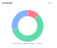


The statuses of the analysis results are color coded in the graphs to let admins of the application see the percentage values.
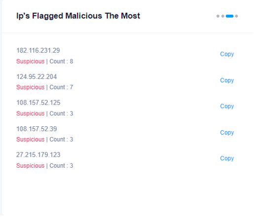
Ip’s flagged malicious most provides the count of the most frequently analyzed URLs, Domains, IPs, and Attachments that have been identified as malicious.
